Product: Portalogic
Portalogic serves as a management application for fresh water loading and wastewater unloading stations. Commonly used by municipal facilities that house and maintain these stations, it allows staff and site managers to track loads, trucks, drivers, expenses, revenue, and many more details of the loading and/or unloading process. This product has been serving the industry for more than two decades, and is the number one application in the United States used for water loading and wastewater receiving.

This Portalogic logo, designed by myself, is the second iteration of the long running software product. Portalogic was rebranded in 2017 along with its rerelease as a cloud-based software. Its classic-clean style and layered water-droplet motif spearheaded an update in the developer's branding across its entire product line.
Problem
Portalogic was already a successful product before I was brought in. What the company needed was someone to look at the user experience and overall design of the software with fresh eyes, and help bring it from a difficult-to-maintain on-premises software product to a state-of-the-art cloud-based web application using cutting edge software technology.
The biggest issues facing any legacy software are customer perception of age, and decades of feature development being buried and effectively lost to the end-user. One of the highest percentage support call topics is customers lacking knowledge of how to accomplish something in the software, which can often be fixed by making them aware of a long-standing feature's existence.
Lastly, the developer lacked both a user experience and front-end designer at the time of the application's first development, and while the product certainly stood on its own, the organization of form and navigation elements left many users confused about where common features and functions were located.
This left me with several objectives.
- Rebranding of product
- Redesign of user interface to match and define new brand standards
- Reorganize all forms and setting interfaces
- Catalog all features and functions and make them more accessible in the interface
- Redesign of user interface to match and define new brand standards
- Reorganize all forms and setting interfaces
- Catalog all features and functions and make them more accessible in the interface
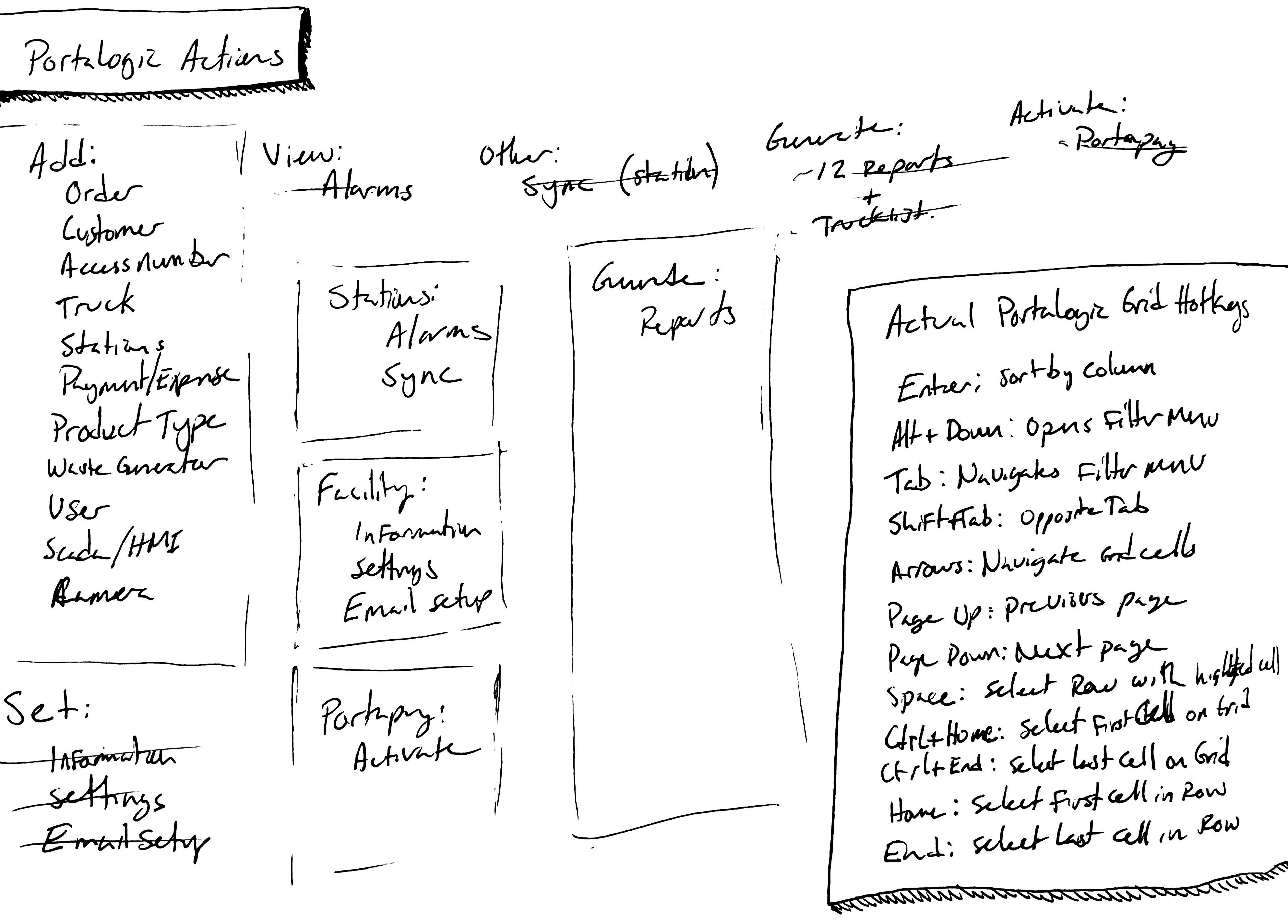
This is an early "wireframe" and a section of notes I used to gain a better understanding of how common action types could be grouped. My goal was to provide users a straightforward way to find and even discover features and functions.
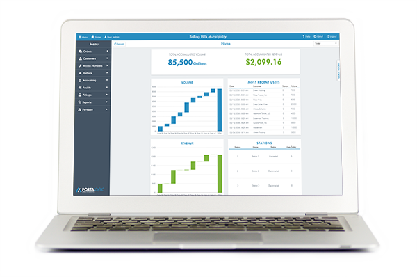
Another feature frequently requested by our customers was a real-time monitoring page of their stations. We began immediately gathering those requests, and I started outlining how we could display the most desired data points. As these stations are often busy throughout the day, and volume can quickly escalate, it was important our charts and diagrams were easy to read and even easier to pinpoint data points on.
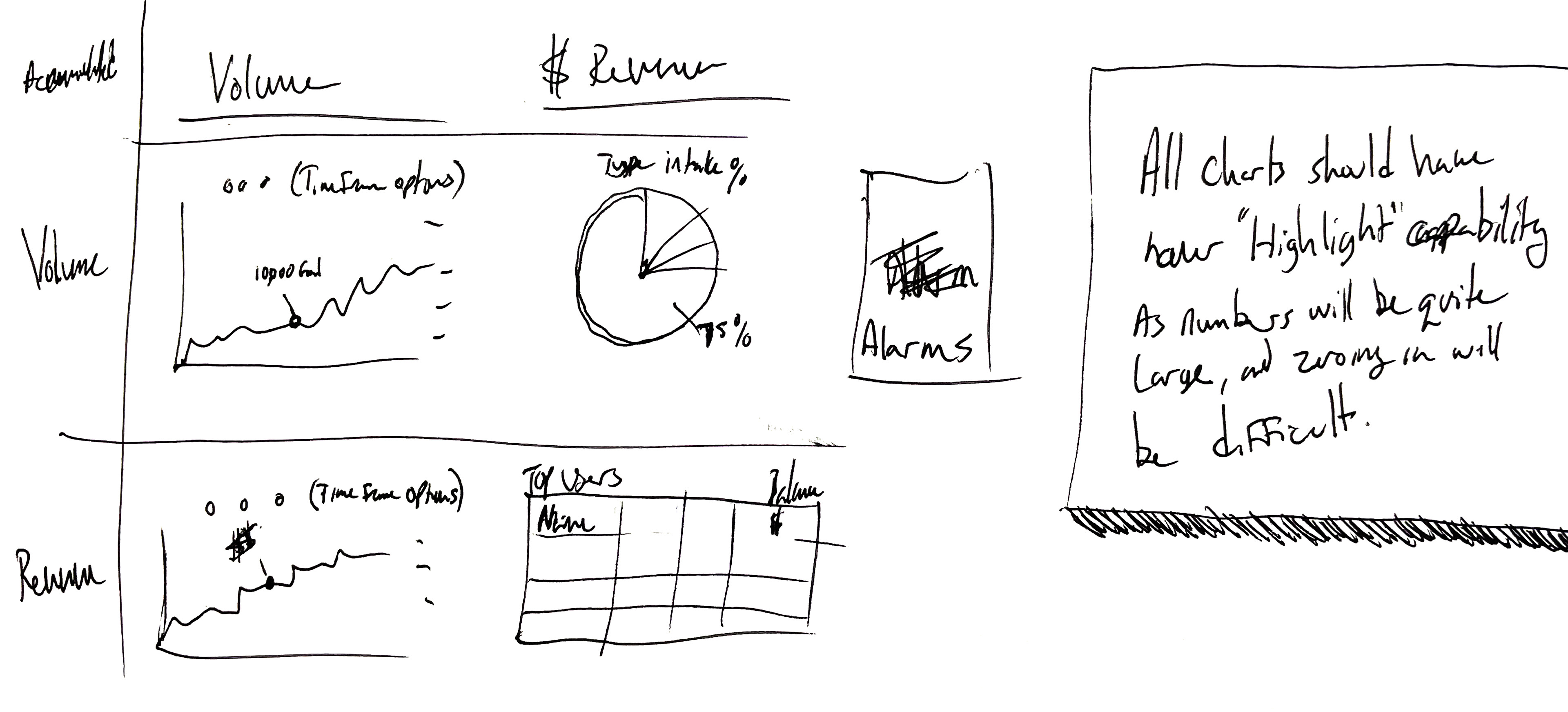
Another loose wireframe with a note-to-self. This new real-time monitor on the home page would need to offer up-to-the-minute readouts of load volumes, revenue per day, revenue by load, and a quick glance at frequent users for the day.
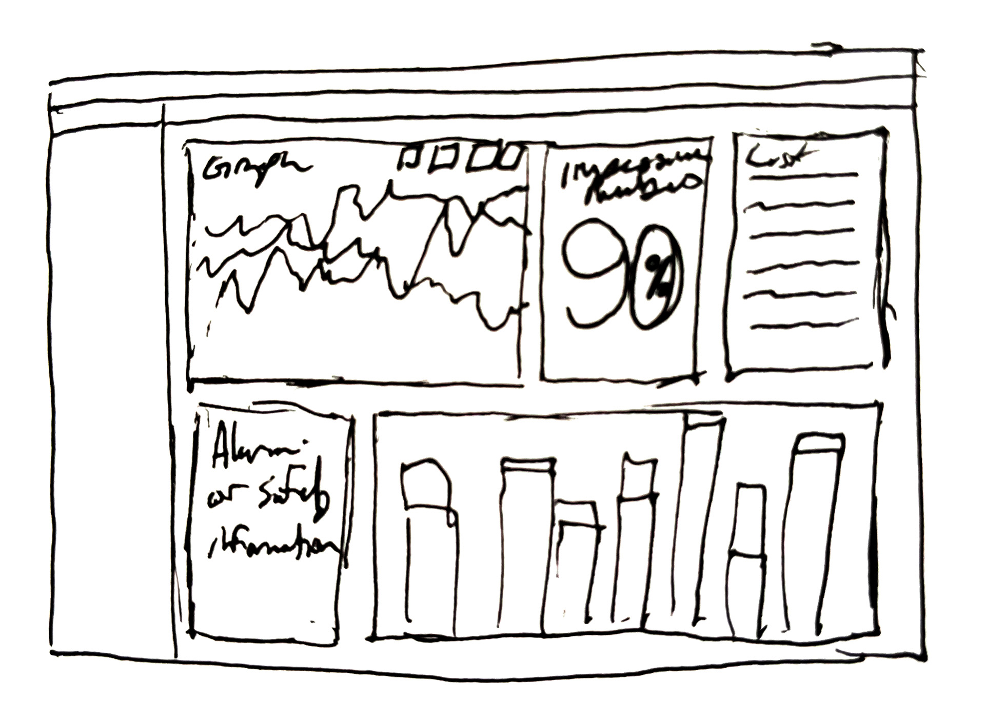
This is an early and idealized impression of what our monitoring page might look like. In the end, this analytical style was abandoned for a much simpler set of charts and figures that better suited our users.
Our initial ideas for our monitoring page were grandiose and complicated. As a result, we took things back a step and chose to address only the most important data for our customers, leaving the rest up to standard reporting and alerts as needed.
Outcome
Much of our testing revolved around ensuring our features were translated correctly to our cloud-based format. The new logo and brand style focused on the importance of water treatment, and went on to define future brand decisions for our other products. Portalogic utilizes a card style organizational system, which helped keep our data in legible formats throughout the software, including on our impressive new real-time station monitor.
All forms and settings controls underwent extensive reorganization. Bootstrap's 12 column grid system went a long way toward helping my developers understand where elements should fall on a page, allowing me to establish a basic left to right, top to bottom order of operations throughout.
The largest challenge of all was in keeping our features accessible, but more importantly, discoverable if a user was unfamiliar with it. Our navigation underwent significant reconstruction as well, with several redefined categories and better organized functions within them. However, with such a robust piece of software, I opted to create a new menu entirely.
Utilizing customer surveys and frequent requests, I developed a "Quick Access" menu. When opened from the side of the screen, the quick access menu places the most commonly used actions as well as a section for some of the most overlooked functions in conveniently organized categories, all on the same page.
Our initial limited release yielded great results, with many users praising the addition of several great features. In reality, the only new features were the cloud-access, real-time monitor, and the quick access menu, which most mentioned as a plus, but had named several others that had been in the software for years. Putting these actions within easy reach made all the difference to many of our customers, and proved just as significant a value-add as actually adding in new features.